When I asked for help last week with a design dilemma, you guys did not disappoint.
I received many comments with some great ideas.
I still love the idea of adding a fiddle leaf fig tree here,
but until I brush up on my indoor gardening skills,
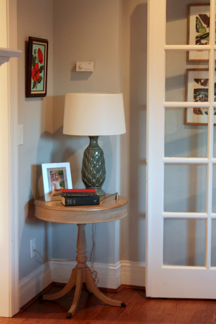
I have filled the corner with the table that was in front of the bay window.
Here's a wider angle of the new and improved corner.
I also made another small change by removing one of the pillows from the backs of the love seats.
I have a love hate relationship with these love seats.
I used to love them, now I hate them.
The arms are too bulky, the floral pattern on the fabric is not my favorite
and they are quite worn from my children using them as trampolines.
I do not hate them nearly as much after removing one of the giant back pillows.
They used to look like this.
And a reminder of how lonely the corner looked before the table moved in.
Ahhhh, much better, even if it a temporary solution.
I also addressed this area.
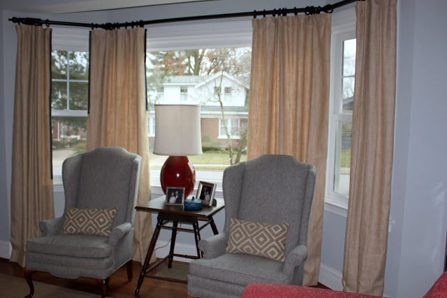
I took down the sheers. When we originally renovated the house, we did not replace this giant window. As soon as we moved in, we realized that was a huge mistake. After making all the other improvements and having everything freshly painted, the giant ugly window stuck out like a sore thumb. Three weeks after moving in, we replaced it. I had added the sheers to mask the ugliness of the original window and even after replacing it, I put them back up. We get a ton of afternoon sun in this room and I was afraid the furniture and rug would fade quickly. When I realized our windows are made from a Low E glass I realized the streaming sunlight wouldn't be as big of an issue as I had thought. Down went the sheers and I am kicking my self for not doing this a long time ago. I love the extra light we get in here now and if the brightness is a problem, I will just pull them shut a bit.
I also brought back in the dark stained table that was originally there.
I think I will paint it glossy black or dark charcoal.
You can see on the left where I am playing around with some trim options.
I pinned up some trim I had on hand. The first option is a navy/charcoal trim.
I also happend to have some deep blue velvet ribbon in my stash and I tacked some of that up.
I am loving this one. What's your vote?
At dinner tonight, I was intently staring at the windows in the kitchen.
My husband got scared and immediately inquired about what I was planning.
You'll have to wait and see......


it is amazing to me what a big difference small changes like that can make! fabulous work!
ReplyDeleteNavy velvet for the trim, love it! Great tweaks, especially the loss of one pillow from the "trampoline!"
ReplyDeleteCathy
Yes yes yes!! Love all of the tweaks - great work Andrea! And I love the removal of the sheers and my vote is for the navy velvet trim too. Yahoo for new looks by rearranging!
ReplyDeleteI love it when a space can be totally changed by only changing a few things! Smart move by taking a pillow off of the couch! It makes it look less bulky! I vote for the blue! I love the grey... but you have grey chairs and maybe a grey table... Blue!
ReplyDeleteDeep blue velvet gets my vote! I used to be an over user of sheers, but am now enjoying more light without them! Love reading your blog. Wish I had your energy.
ReplyDeleteBeautiful living room!!!! It is always amazing how tiny changes can make such a difference! My vote is for the blue velvet.
ReplyDelete~Des
I want to change out my sofa too. All I see is dirty. I have slipcovers but it is like wrestling an alligator to get them back on. I need to wash them once a month and the fabric is already starting to peel... anyway. I think everything you have done looks lovely! The velvet trim is perfect.
ReplyDeletexoxo
Amy R.
I didn't think of any of those when you asked, but the changes really look great. The round table with accessories really draws attention away from that little bump-out in the wall in that corner. I too vote for the navy velvet trim!
ReplyDeleteThe lamp and table in the corner really add a nice touch! I like what you did with the love seat, too. I couldn't figure out where the third pillow went until I saw the before picture!! Good thinking!
ReplyDeleteXO,
Jane
Isn't it amazing what a few small tweaks can do for a room! Love the sheerness windows too - so much lighter now. So funny to see we have such a similar house layout! My living room has two french doors in the back that lead to my small family room! And I think I recognize those fab thrift shop lamps!!
ReplyDeleteKelly
Looks great! The removal of the sheers make a big difference and I still love the idea of adding the trim to the curtains. Way to get things done!!! :)
ReplyDeleteVelvet trim for sure, and the switch ups look perfect :)
ReplyDelete